

THIS IS THE BEST DAY YET.
LIKES:
A title in colored font
I’m sitting right next to one of my bookshelves and there’s a definite theme: many of my favorite books have titles in insane colors. That kind of detail draws my eye.
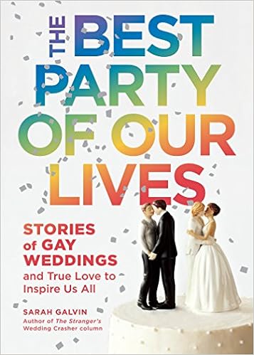
An example: The Best Party of Our Lives has a rainbow spine with white font, while the front is white with rainbow font. That’s ADORABLE.
Also, if a book has shiny and/or raised font, I am likely to pick it up.
Paperback/flexible binding
Fancy collector’s editions and author-signed copies tend to be in hardback, so…I GET IT.
But holding a paperback in my hand feels so right. Reading a hardback feels formal; I feel pressured to learn. Paperbacks feel more personal; I can curl up easier with a book that has some give.
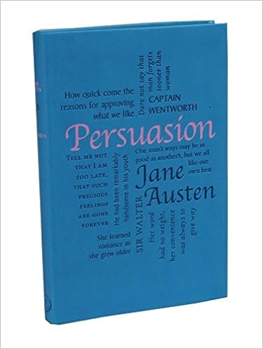
Confession: I bought a fancy copy of Pride and Prejudice at Barnes and Noble several years ago.
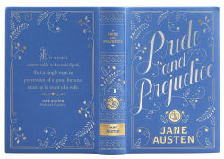
A year later, I saw the complete works of Jane Austen in pastel, flexibound covers, Pride and Prejudice among them.
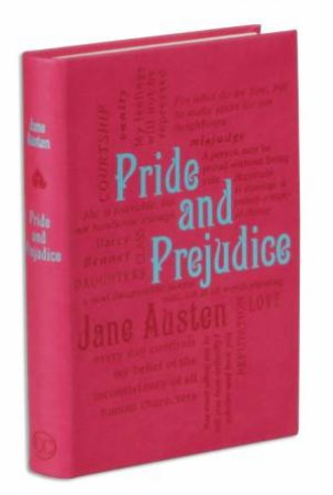
I bought all six.
They just feel so good. The fancy copy has a nice heft and gold detailing. The other one is hot pink and lightweight and fits so nicely next to its literary sisters.
I also have a similar-looking copy of Jane Eyre. I hadn’t even READ Jane Eyre at the time of purchase – I just liked how it looked next to Pride and Prejudice!
Pocket Editions
Technically, these last two have had more to do with the book than the cover, but give me a tiny book any day.
I don’t know why I feel so cool when I whip out a COMPACT COPY of, say, We Should All Be Feminists or How to Choose a Partner.
Maybe I feel like a secret agent? All covert and whatnot with my reading choices?
Bright colors
Get your gross gray books out of here. I want my bookshelf to look like a color EXPLOSION.
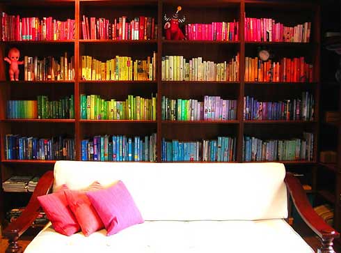
Purple and light blue are my current favorites, but I’ll take a touch of hot pink.
Know which series did this well? The Princess Diaries. The newer covers are…pretty lame, but the originals were pink with shiny tiaras, roses, and other royal accessories.
I did try to organize my books by color. I don’t have the eye or the patience.
Rainbow
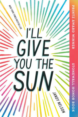
I will buy literally anything with a rainbow motif. I bought the paperback collector’s edition of I’ll Give You the Sun for the holographic font and rainbow border.
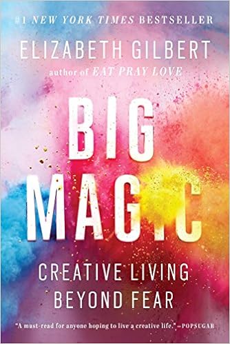
I was skeptical of Elizabeth Gilbert until I glimpsed Big Magic’s delightful tie-dye cover.
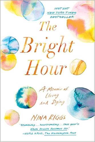
I also picked up a CANCER MEMOIR because of the rainbow watercolor artwork on the front. I regret that now.
Quotes
The other reason I like Word Cloud Classics? They come covered with quotes.
Words are my favorite medium, so word art really does it for me.
Girls wearing dresses and/or capes
Listen…I own the entire Selection series. In college, my interest was stoked by America’s fantastic ruffly blue dress. Then Eadlyn picks up the trend in the spin-offs with some great purple gowns.


Dresses usually indicate a female protagonist (obviously) and romance – you don’t get all femmed up like that for NOTHING.
Also, capes. Usually I see green capes, but red or blue capes make an appearance. Throne of Glass snowed me this way; Tamora Pierce got me a couple times, especially in The Song of the Lioness quartet.
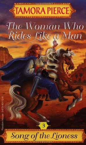
Capes suggest battle, fantastical intrigue, and possible assassination. Also, what is WITH all these girls and their long, flowing hair? I mean, they look FANTASTIC, but you’re in the woods with a cape, ostensibly hunting or being hunted. Don’t you want to tie that up?
Wedding/birthday paraphernalia
RARELY DOES IT WORK IN MY FAVOR.
The Best Party of Our Lives and Something New did come out of this obsession, though.
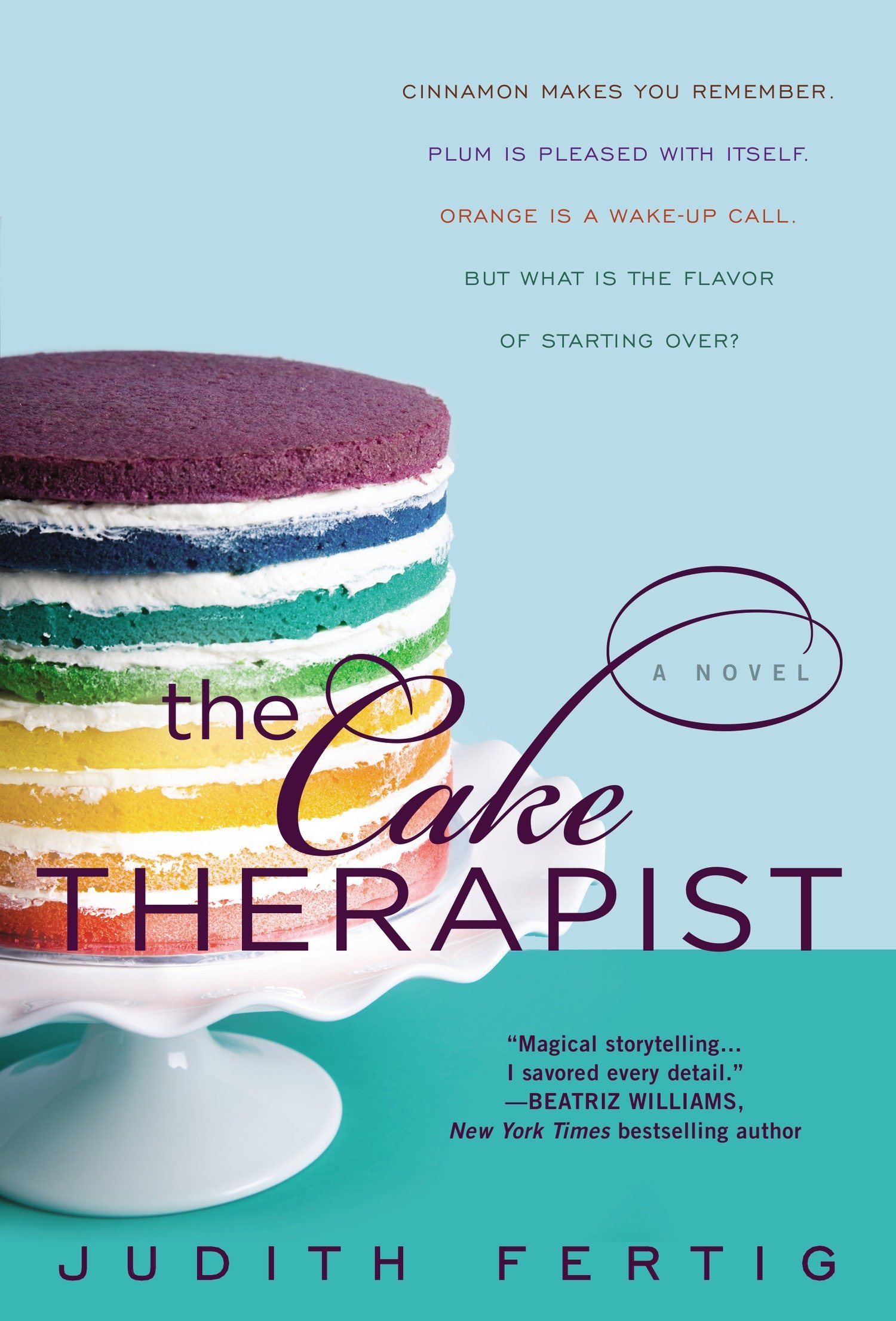
Cake
Honestly, any food is good, but cake is my favorite.
Even if a book looks stupid, I’ll consider reading it if it has a nice-looking slice of cake on the cover.
Weapons
Nothing says feminist fantasy like a SWORD AND/OR DAGGER ON THE FRONT, AM I RIGHT!?

I mean…I am right. I use this symbol to locate new girl-power reads.
Cutesy animals
Before I knew what the book was about, I dreamt up a cover for John Green’s Turtles All the Way Down that had turtles suspended in mid-air.
The Ruby Oliver books use ceramic frogs and penguins. The third book twists the formula with a marshmallow snowman. The original release of Real Live Boyfriends had a ceramic deer on the front.

Silhouettes
Because it’s easier to insert myself into the story when I can’t see anyone’s face.

DISLIKES
Author photos
Ugh, those stupid Barnes and Noble classics with the stupid paintings and puce borders? YOU KNOW THE KIND I MEAN.

These editions are always on sale and I hate them. I HATE THEM. They’re thick and ugly and disgusting.
Thick pocket editions
Listen, fantasy books: you need to chill out. I would rather read a book the size of a movie script than a pocket edition that weighs ten pounds.
I’ve read your books, George R. R. Martin. 800 pages is pushing it, sir.
Also, I’ve been unable to finish Outlander because the copy I bought is SO THICK. Even when I think I’m making progress, I’M NOT REALLY.
Drab colors
I bought a bunch of bargain classic books in brown and grey.
They were the ugliest books I’ve ever owned.
I cleansed my bookshelf of them.
Nature
Boring. I don’t want to read about some mountain, brokeback or no.

Classical/historical artwork
This bodes ill. The most interesting books on ancient Greece that I’ve read created interest with color and image placement. When I see an exact replica of, say, Leda and the Swan, I know the author’s about to tell me a WHOLE BUNCH OF FACTS.
Yuck. Avoid.
Old-timey photographs
Also yuck. Every Civil War-era soldier I see tells me I’m in for a boring, factual ride.

Fantasy novels that look like ’80s album covers
“Fantasy isn’t nerdy! Fantasy is super cool!”

(This also applies to sci-fi covers and is one of the reasons I refuse to read “classics” like Dune.)
I don’t CARE how intricate your world is. If your novel LOOKS tacky, it IS tacky.
Title-only covers
Especially grainy hard-books in somber covers that look like they were published in the 1940s.
Give me SOMETHING interesting to look forward to, please.
Better-looking foreign editions
Listen here: I’ve purchased some fine-looking books in my day.
So it gets my goat when I discover the foreign edition of some book LOOKS EVEN BETTER.
Like, WHAT IS THIS!?
I’m not saying I LIKED that book, but LOOK HOW PRETTY!!
Sometimes, though, living in the U.S. proves beneficial.
Just imagine what would have happened if THIS edition had been released in the States:


2 thoughts on “10 Day Book Blog Post Challenge #4: Book Cover Likes and Dislikes”